First impressions matter, especially in the online world with short attention spans and fierce competition. That’s why landing pages play a crucial role in the success of any digital marketing campaign.
However, even the most well-designed landing pages can fail to convert if common optimization mistakes plague them.
This guide highlights these mistakes and provides actionable tips on how to avoid them, so you can create landing pages that look great and drive results.
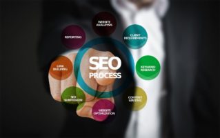
Landing Page Optimization
Landing page optimization means improving the performance of a landing page, which is a web page designed specifically to receive traffic from a particular source, such as a search engine or an advertising campaign. A landing page, also, unlike a homepage, usually has a specific goal that can be summed as conversion.
In essence, the objective of landing page optimization is to increase the conversion rate of the page. This means raising the percentage of visitors who take a desired action, such as purchasing, filling out a form, or subscribing to a newsletter.
Exploration of Common Mistakes
This section explores some of the most common mistakes marketers make when optimizing landing page pages. Here, you’ll find advice on how to avoid these mistakes.
1. Non-Persuasive Headline
Having a bland headline is one of the most common mistakes in optimizing landing pages because marketers don’t pay enough attention to the copy.
The headline is the first thing visitors encounter on your page. So, it can either make or break a visitor’s decision to remain and take action.
Suppose your headline fails to grab their attention or convey the value proposition of your product or service. In that case, visitors will likely depart without engaging in any activity and talk less, making the desired conversion.
How to avoid:
Craft a clear, concise, and persuasive headline that employs powerful and action-oriented language to highlight the benefits, not just a dry list of the features, of your offering.
Additionally, the headline should be consistent with the other content on the page, providing a seamless and coherent experience for the visitor.
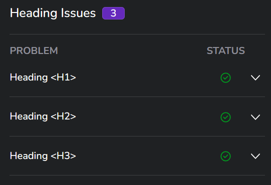
There should also be the use of important keywords in the header section, and you can confirm the use of this using the Eye10 On-Page SEO tool.
2. No Clear Call-To-Action
The CTA typically appears as a button or link that urges visitors to take a specific action, such as registering for a free trial or purchasing a product. As a marketer, you want your CTA to be the most noticeable item on the page to sway visitors toward the action you want them to take.
Otherwise, if you have a non-evident CTA, visitors may overlook it because they are unsure of what action to take upon encountering your landing page.
How to avoid:
Prominently display your CTA on your landing page so that it is unmistakable. Also, it should effectively communicate the desired action to the visitors.
You can achieve this by using language that emphasizes action and generates a sense of urgency to encourage visitors to take action. It should be distinct from other content on the page and easy to spot.
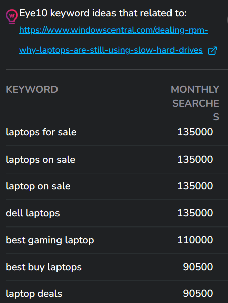
Also, your CTA should include actionable keywords. If you run out of keyword ideas, the Eye10 Keyword Planner is always available for you to generate more.
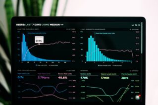
3. Slow Loading Speed
What if your headline and your CTA are fine? Is that all? Sadly, no. The performance of your landing page makes no small impact in determining whether you will convert visitors or not.
The most important technical performance issue is speed. If your website cannot load fast enough, then there will be detrimental effects on your conversion rate. Even a one-second delay can lead to a decrease in conversions. Hence, your page must always load speedily.
How to avoid:
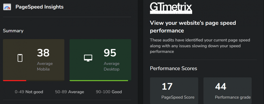
Make sure that your landing page is optimized for speed. Utilize the Eye10 Pagespeed tool to detect and fix any problems causing your page to load slowly, such as optimizing images, compressing files, and minifying code.
Select a dependable web hosting provider that can handle high traffic volumes and provide speedy load times.
4. Not Optimized for Mobile
Since mobile devices generate over half of all internet traffic, your landing page must be mobile-friendly. Visitors are likely to leave without taking any action if your page is challenging to navigate or doesn’t display correctly on a mobile device.
How to avoid:
Design your landing page with mobile devices in consideration. Use a responsive design that automatically adapts to the screen size of each device. Avoid using large images or videos that can slow the page’s loading time on mobile devices.
5. Cluttered Layout
A cluttered layout on your landing page can be overwhelming and distracting for visitors, leading them to lose focus on the crucial information you are trying to convey.
When your page has too many elements competing for attention, it can be confusing and frustrating for your visitors, causing them to leave without taking any action.
How to avoid:
It is best to keep your landing page layout clean and simple. You can achieve this by incorporating plenty of white space, giving your content room to breathe, and making it easy to read.
Ensure that the most critical elements are displayed prominently, so visitors can easily find what they seek.
6. Complicated Forms
When designing a landing page that features a form, it’s crucial to prioritize simplicity and ease of use. A convoluted or overly long form can leave visitors feeling frustrated and discouraged, ultimately leading them to abandon the task altogether.
How to avoid:
Keep your form as brief and straightforward as possible. Only request the necessary information, and explain clearly and simply why each field is required.
Additionally, implementing auto-fill or auto-complete features can significantly expedite the process and enhance user satisfaction.
7. No Social Proof
Social proof is incredibly valuable for establishing trust and credibility with your audience.
Without social proof, such as customer reviews or testimonials, it can be challenging for visitors to trust your brand and take action fully.
How to avoid:
Incorporate social proof into your landing page through common techniques such as featuring customer reviews or testimonials. Make sure that these reviews and testimonials highlight the benefit of your product or service. This shows potential customers that they are in for a positive experience once they purchase or sign up for your service.
In addition, include social media sharing buttons where appropriate and if appropriate. It encourages visitors to share your content on their social media profiles. This further helps your brand to gain more exposure, spread its message to a wider audience, and gain credibility.
Conclusion
With the tips and strategies outlined in this article, you’ll be well on your way to creating high-converting landing pages that look great and deliver results. So go ahead and put these insights into action, and watch your conversion rates soar.
You also need real-time insights and data from a solid SEO tool like Eye10. With that, you can challenge your competitors and ensure your SEO decisions are well-informed. Without further ado, it’s time to sign up for Eye10 now!
FAQ
How can I make my landing page stand out?
You can use attention-grabbing design elements, such as a contrasting color scheme or bold typography, create a unique and compelling value proposition, and focus on the benefits of your offer rather than just the features.
What is the difference between a landing page and a homepage?
A standalone landing page is designed to convert visitors into leads or customers. At the same time, a homepage is typically the main page of a website that provides an overview of the business and its offerings. Landing pages have a specific goal and are designed to focus visitors' attention on a single offer. In contrast, homepages have a broader purpose and are often designed to provide navigation to other parts of the website.
Why is it important to have a clear value proposition on your landing page?
A clear value proposition communicates the offer's benefits and sets expectations for what visitors can receive in exchange for their information or purchase. Visitors may not understand the offer's benefits without a clear value proposition or hesitate to take action.
The Role of Microdata in SEO Businesses rely extensively on search engine optimization (SEO) to get potential clients to their websites in the current digital era. While many SEO strategies focus on enhancing website structure and content, micro data is becoming an increasingly significant component of SEO. We’ll go through microdata, how it affects SEO, […]
How Do Page Titles and Descriptions Impact Organic Search Visibility? The visibility of organic searches is impacted by page titles and descriptions, which are important SEO components. They are crucial components that aid search engines in comprehending the subject matter of a webpage and how it relates to a user’s search query. In this post, […]
How Can I Use Analytics to Inform My Organic Search Strategy? A strong online presence is essential for companies of all sizes in the current digital era. Organic search is one of the best strategies to increase your exposure and increase traffic to your website. The method of bringing traffic to your website via unpaid […]
Landing pages are among the most effective ways to convert visitors into leads, customers, or subscribers. But how do you make sure your landing page attracts the right audience and persuades them to take action? The answer is keyword research. You can create landing pages that match their needs, interests, and intent by understanding what […]
We live in a mobile age, and technological advancements have made people expect things speedily. It is not enough that your web page loads fast. If your definition of ‘fast’ is not under 2 or 3 seconds, you will probably have several displeased visitors. Therefore, website speed and overall website performance are very integral to […]
Landing pages have a clear goal: to capture and convert leads. How can you ensure that you are doing that effectively? It’s easy to look at the numbers and quantify your performance, but the real work is raising the quality of your landing pages. In this article, we go through each element of an effective […]
Google Accelerated Mobile Pages consist of a web development framework created by Google to help publishers create faster-loading web pages optimized specifically for delivering content to mobile devices. It follows a set of open-source web standards and technologies that ensure the reliability of browsing on mobile devices. Content is served from the Google AMP cache, […]
How to Use Link Building for SEO Link building is an essential component of search engine optimization (SEO) that involves acquiring links from other websites to your own. This practice can help improve your website’s Google ranking by increasing its authority and relevance. This article will explore how to use link building for SEO and […]
How to Use Internal Linking for SEO Internal linking is an important part of search engine optimization (SEO) that is often overlooked. Internal linking involves linking from one page on your website to another page on the same website. It is essential for SEO because it helps search engines like Google understand the structure and […]
Keep Up To Date With Eye10
Subscribe To Our Eye10 Newsletter
Get Eye10 Updates - Learn SEO Tips - Read Our Latest Blog Posts